Hi Friends,
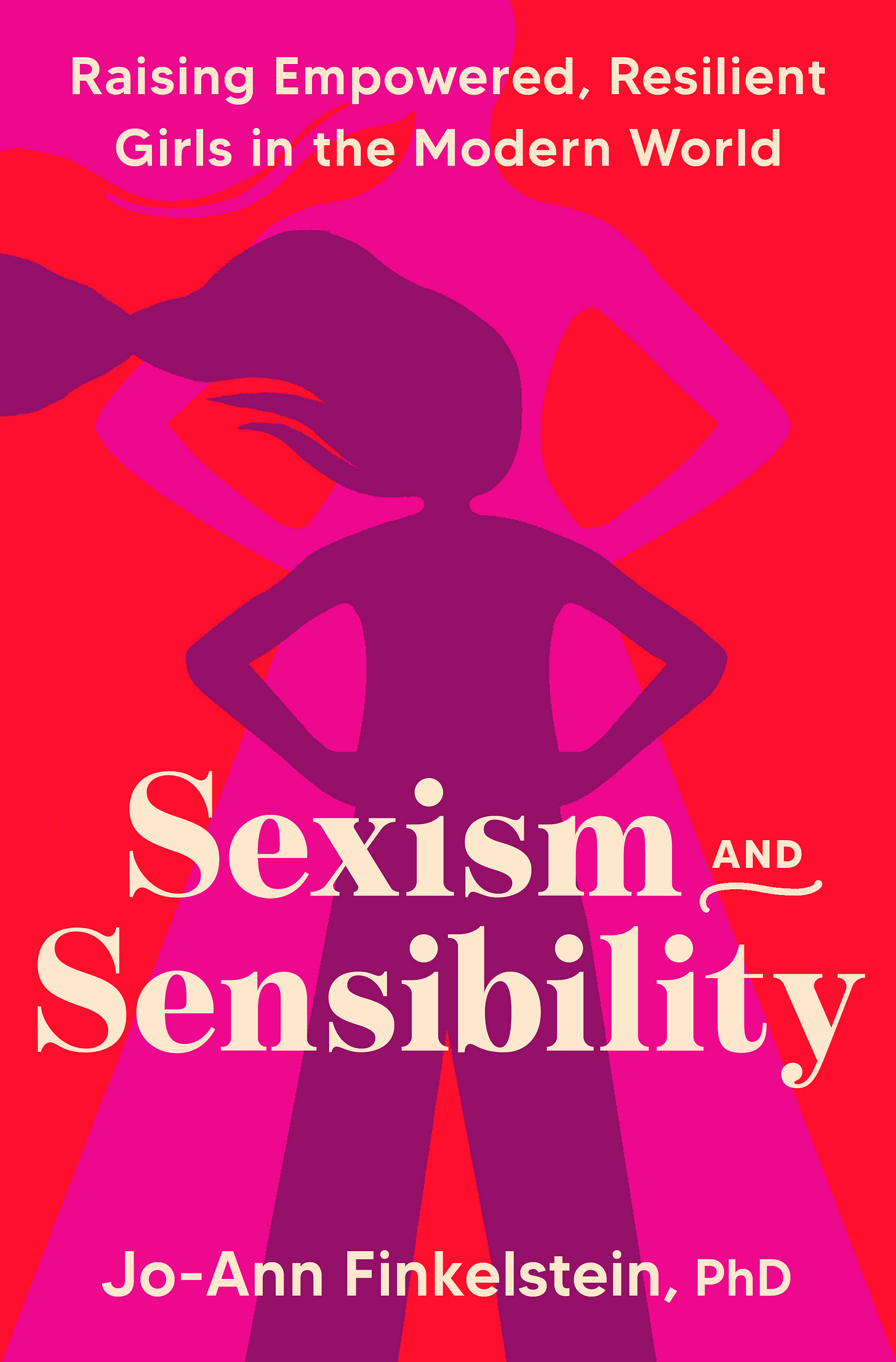
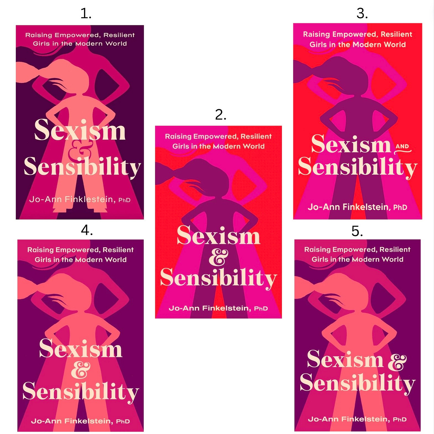
It has been such a pleasure writing for people so invested in the topic of parenting girls and being a woman in this sexist culture. Your comments, shares, and support inspire me everyday to write. So, I was excited when my editor said I could have you weigh in on the final cover choice for my book, Sexism & Sensibility: Raising Empowered, Resilient Girls in the Modern World which comes out September 3rd!
Some of you have asked to hear what the publishing process has been like. The short answer is: nuts! But I promise, I will have a post about it all (including a timeline for dramatic effect) when it’s complete. For the cover, I was only given this choice but my editor listened to my ideas and fought for a great cover. She saw many others before approving this art. I have had too many friends who ended up in tears over their covers so I’m grateful to my amazing editor for this powerful one. But I need help choosing the right colors, which is where you all come in.
You’ll see the covers are mostly the same except for the color and the placement of the ‘&’ or ‘and’.
Note:
The red one won't be neon when not on a screen
The girls legs in the darkest one will bleed off the page like the others
I have asked for some slight changes in the art (e.g., the girl’s hair) but those will come later.
So…without further ado, here they are. Please use the poll to vote and feel free to comment in the comment section.
Xo
Jo-Ann


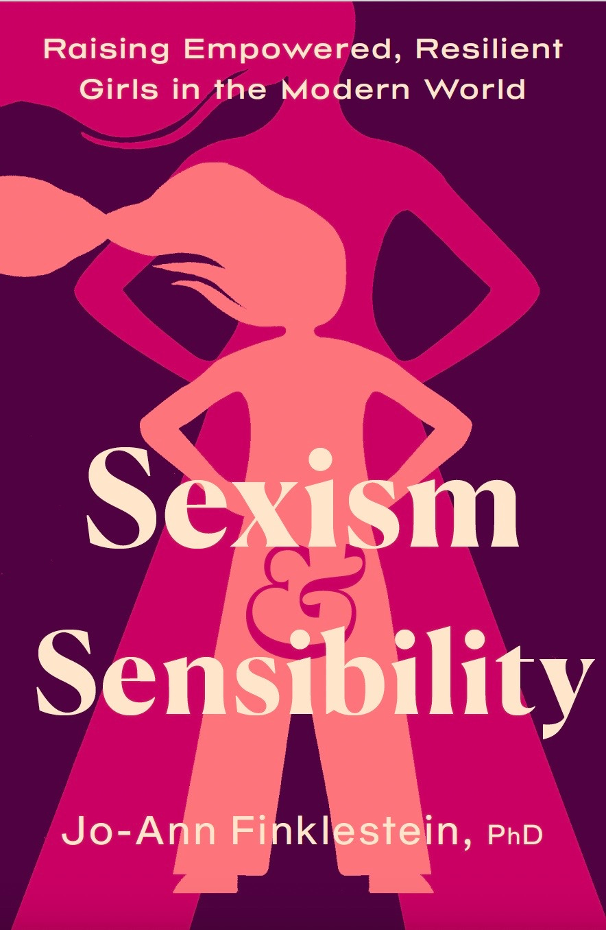
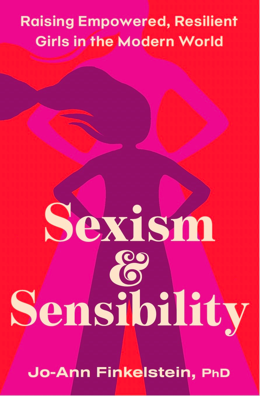

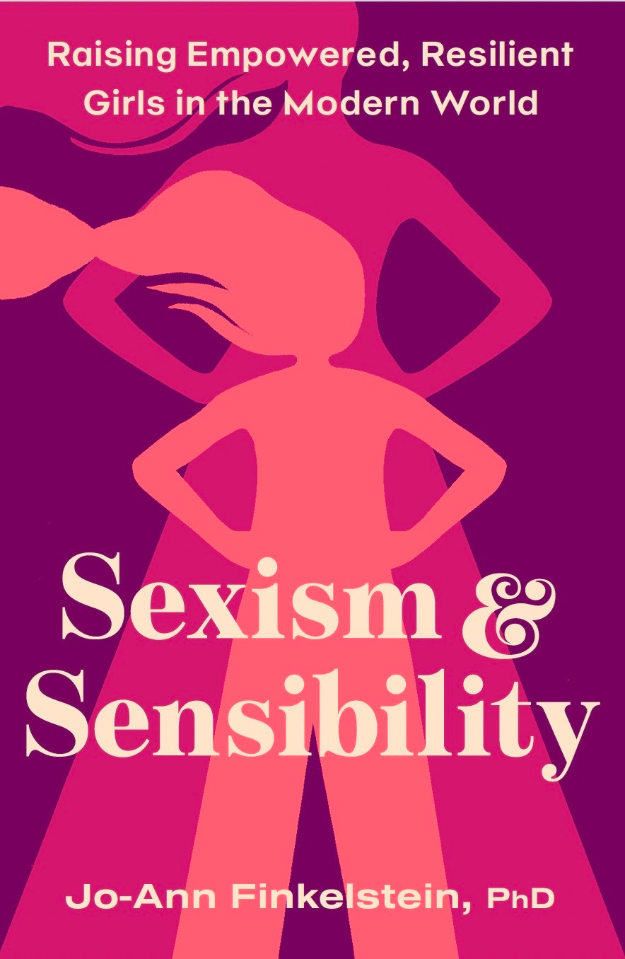
Is the & supposed to be on the pubic area of the girl? That was the first thing I saw on 2 and 4.
First of all, congratulations ! I can’t wait to read this book. I voted for #3 because I think that’s the best text layout, but I prefer the other colors.